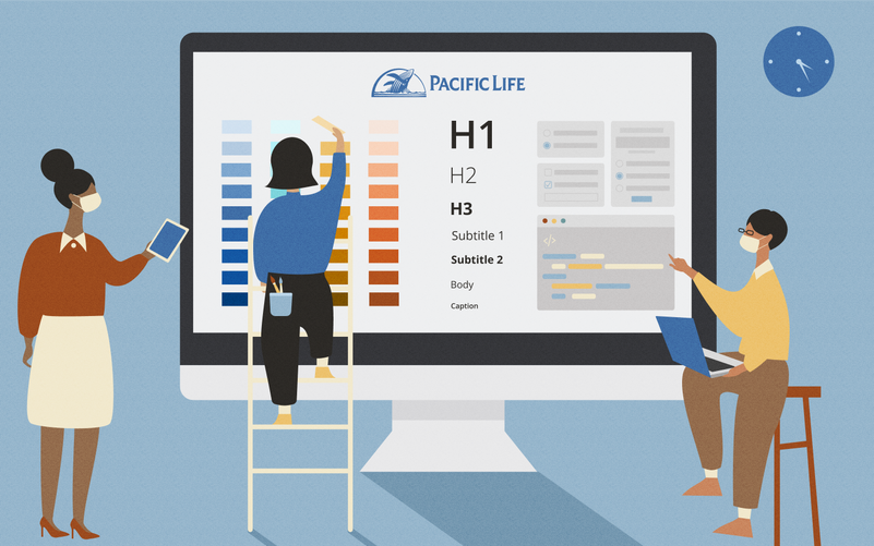
Pacific life design system
Create One Pacific Life Experience

Project Goal
For Customers: create a consistent visual language across our different platforms to provide a One PL Experience.
For Designers & Developers: close the gap between designers and developers who work on multiple product to avoid recreating work other teams have already done. Instead, we can focus on addressing bigger problems.
Pilot Target Users
Designers, developers, content editors.
Project Timeline
The Pacific Life Design System Team formed at the end of 2020. It's an ongoing effort with the goal of building a robust pattern library in 2022.
My Role
Work stream lead for style and component team on a 6-week task cycle. My responsibilities include sprint planning, facilitating design mob sessions, leading research and design exploration, aligning with stakeholders, and organizing monthly share demos.
Why we need a design system
Challenges
-
Inconsistency: without clearly defined guidelines, divisional teams value design flexibility more than consistency.
-
Disorganized brand management: our silo'd team structure leads to silo'd decisions.
-
Decentralization: we have not defined what the Pacific Life customer experience is across the enterprise.
-
Lack of Shared Definition: unclear positioning, limited brand attributes, and undefined voice & tone
Opportunities
-
Provide actionable, practical and empowering design principles that allow teams to experiment with limits.
-
Identify opportunities to leverage shared insights across teams and divisions.
-
A unified definition of the Pacific Life customer experience enterprise-wide.
-
Documentation of brand attributes and how they're implemented.
-
Flexible principles for "human" language that can span across audiences.
Desired outcomes
Consistent Experiences Across Enterprise
Interconnected Brand Experience
Clearly Defined Brand Attributes
Collaborative Brand Management
future vision
I illustrated the future vision story to help visualize and communicate more broadly why we should build and follow a design system.
Component & style work stream
I'm leading a team of 6 designers in building the foundational styles and components for the design system. We work in 4-week-sprint designing and review cycles. Below is an overview of today's end-to-end process for the creation of components.

how we approach colors
I want to highlight the process of creating color styles in the design system - not only because I'm alway obsessed with colors, but more importantly, we have a problem here - there were so many different blues used across the Pacific Life websites and products.

Introducing Pacific Life New Blue Palette

Highlights of New Palette
-
Associated with Pacific Life branding by using the blue (#004785) from Pacific Life's logo mark as the foundation block for the palette
-
All color usage meets WCAG 2.1 Level AA recommendations for contrast.
-
Created color variants to support:
-
Usage in both light and dark themes
-
Hover, active and focus states in actionable elements such as buttons, links, etc.
-
-
Applied a systematic approach to color that creates flexibility for designers to generate color variants (see the color variants below created for system colors applying the approach)


